Consistent hierarchy
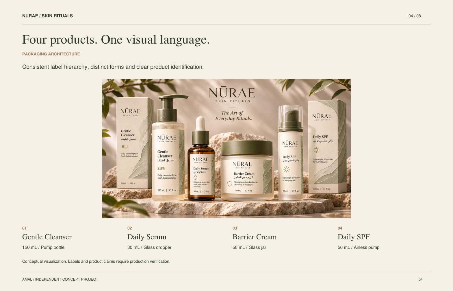
Brand and product names occupy fixed positions. The Arabic descriptor has its own line, and the volume remains separate from the marketing hierarchy.
AMAL / Independent concept study
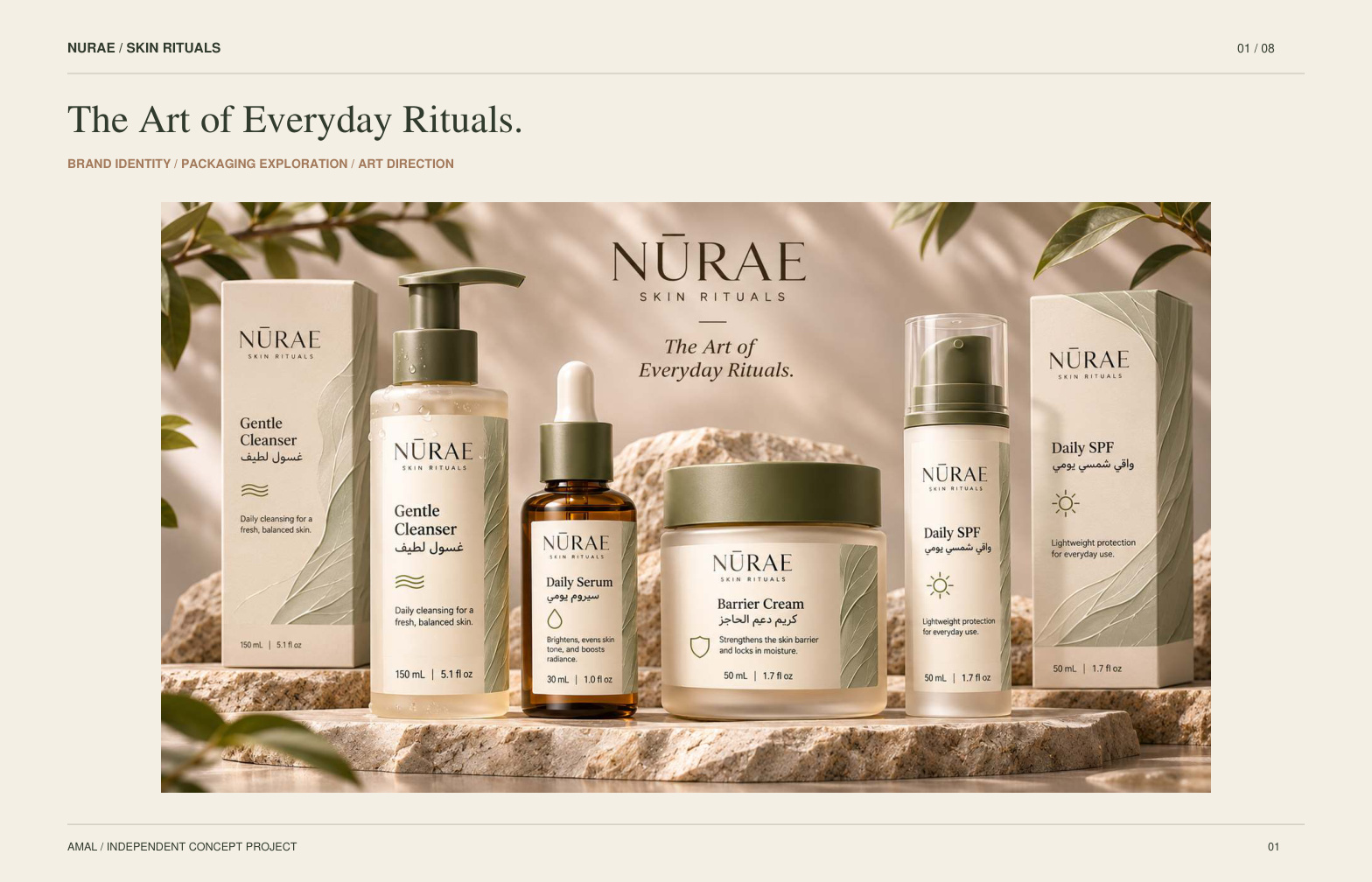
A coherent four-product skincare identity.
Visual direction, front-label studies and packaging presentation.
Case-study PDF + editable SVG label concepts.
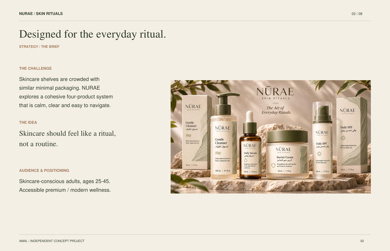
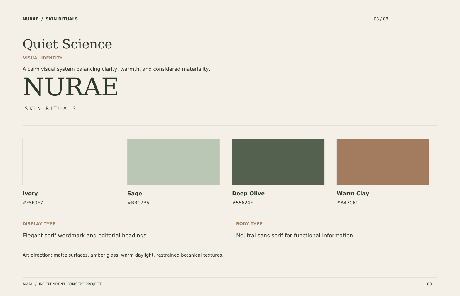
A four-product skincare system exploring consistent hierarchy, muted colors and coordinated primary and secondary packaging.
Scope: Brand direction, visual identity, packaging exploration and illustrative mockups. Production artwork and supplier dielines are outside this concept study.
Open full case study PDF ↗Design detail / Editable front-label system
Four flat label studies make the hierarchy visible: brand, product, Arabic descriptor and volume. These vector concepts can be inspected separately from the illustrative product mockups.
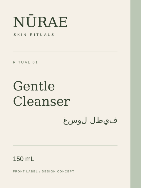
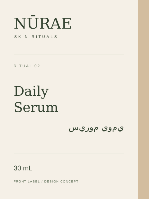
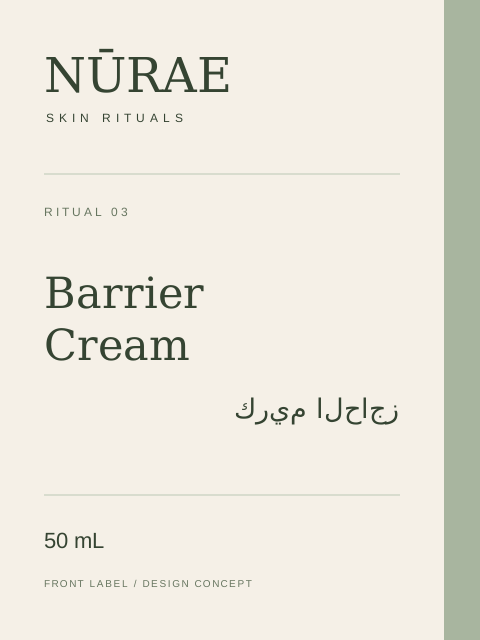
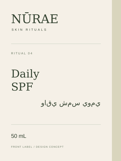
Brand and product names occupy fixed positions. The Arabic descriptor has its own line, and the volume remains separate from the marketing hierarchy.
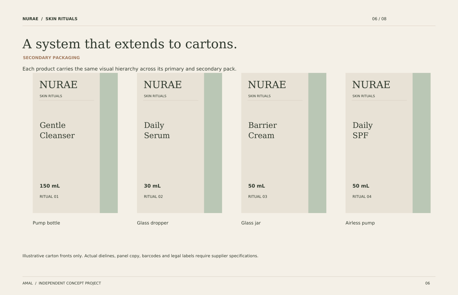
Numbering, product names and a muted color strip distinguish the range without changing the overall structure.
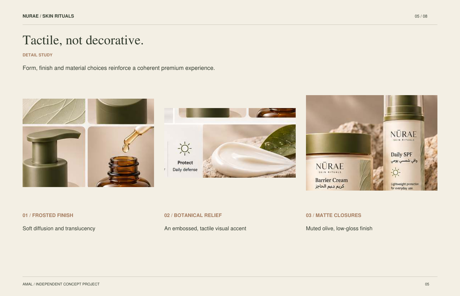
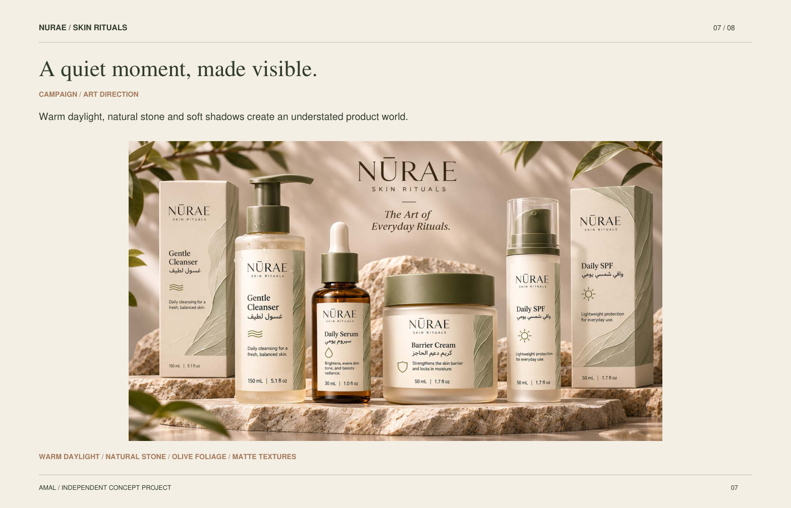
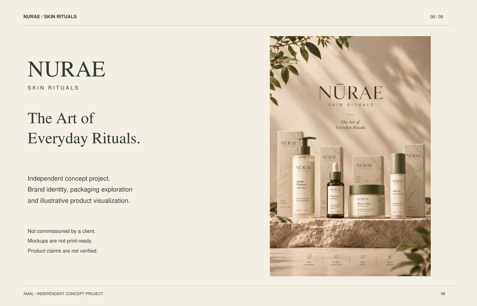
Independent design exploration. These are front-label concepts, not production dielines. The mockups below illustrate art direction and may differ in detail; the flat artwork is presented separately so its text and structure can be inspected. Final dimensions and mandatory product copy require a supplied production brief.
Self-initiated portfolio study. Not commissioned by a client. All sample business details are fictional.
Discuss a packaging design project ↗